Sign Up
Already have an account? Sign in here
Sign In
Dont have an account? Sign up here
The Value of Colour
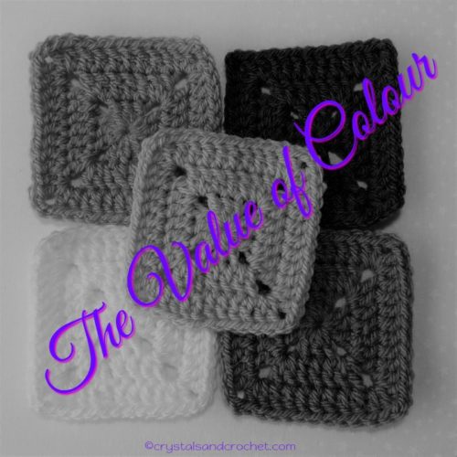
Colour is a major stumbling block for many people, and choosing the right colours can make the difference between loving your project or being disappointed with the finished item.
♥ I have covered the basics of colour in A World of Colour, Colour Me Happy, and Choosing Colours for Your Crochet Projects.
But…in this article I would like to help you even more, we are going to look at the value of colour in a little more depth [pun intended!], so grab a cuppa and a cookie, and settle down while I ramble on for a while.
♥ As I have previously said, all colour has depth – how light or dark a colour is, and tone – the combination of colours, that is how much red, blue, yellow is in the mix.
♥ This is a trick I learned a long time ago, and something that becomes very important when you want to work predominately with one tone.
♥ Some folk have an eye for colour, and some folk don’t. the easiest way to look at the depth of a colour is to take a photo and then make it black and white.
♥ All the squares I have used for this article are made with Stylecraft Special Dk.
Let’s look at a selection
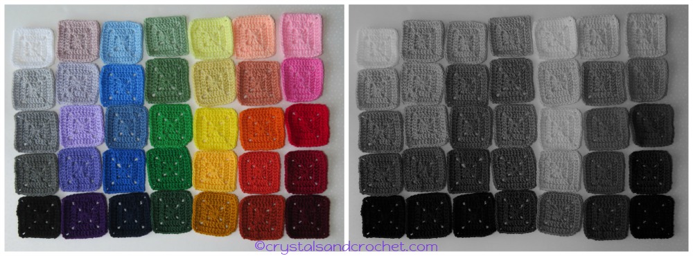
Starting on the left, with White working down to Black you can see that when we look at the black and white picture it is exactly as we would expect it to be, because greys are shades of black/white.
As we move through the other shades on the coloured picture, we can see that the intensity or tone of the colours, makes them look different. But look at the black and white picture.
Do you see how the Yellows all look lighter than the others?
Yet when greyed out we can’t tell the difference between the Greens, Blues, Oranges etc. This is because red and blue have more depth than yellow, so where there is more red or blue in the tone of a colour it will always look darker.
♥ Imagine you are making a blanket for someone who is colour blind, you want them to be able to see the difference in the stitches you have made, or certain sections, or shapes within the overall design.
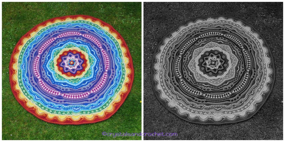
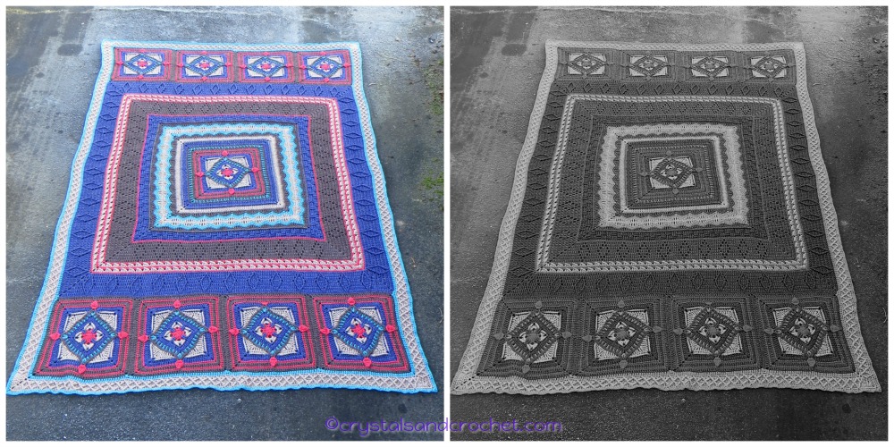
Mandala Madness is a great example of this, the ever changing shapes, stitches, and textures. The Rainbow version is a riot of colour, but if you can’t see the colour, by using different colour values together you can still see the pattern.
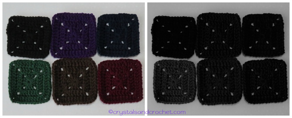
If you wanted to make something with darker colours, say something more “manly”, and you use different tones, but all the same depth, then your pattern could easily be lost.
But by adding a couple of lighter colours, the pattern comes to life, as shown here with the Diamond Geezer-Ghan.
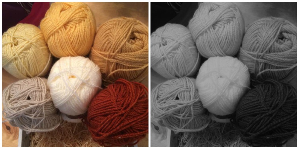
This article came about, because I was asked a question in my Facebook group Helen’s Hookaholics. Christine Rigby, one of the members, asked my opinion about some colours for her next Mandala Madness.
This was Christine’s photo.
Beautiful, soft, warm colours, but the Parchment, Buttermilk, Camel, and Stone all have the same depth, so unless each time these are used the Cream or Copper is either side of them, the overall look would be quite flat.
So this collage is about playing with warm neutrals.
Take a look at this next picture…..
The same nine colours in each one, but with the order of colours moved around.
Which gives more contrast/interest to the layout of the colours?
This is how you choose which colour to put where.
The selection on the left would give the most contrast, and highlight your stitches, and the texture within the pattern to best effect. With the other two there are too many of the same depth together.
♥ Remember in Choosing colours I talked about 5 being the magic number.
Let me just remind you… pick 5 shades of the same colour, then replace 1 with a neutral, and 1 with a contrasting tone.
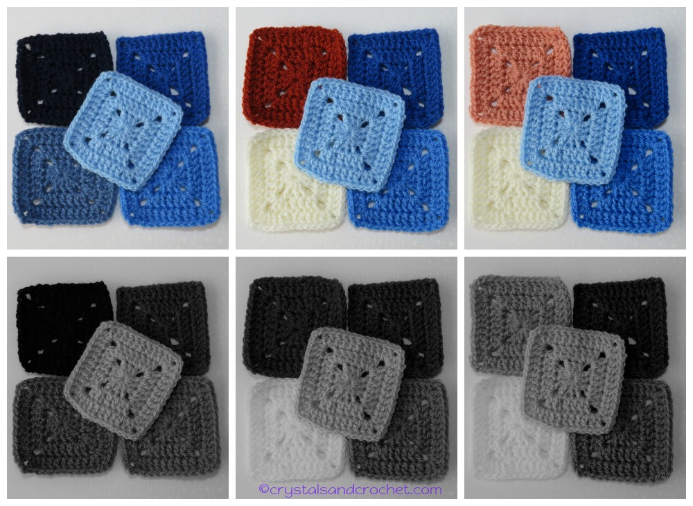
I picked 5 Blues, Midnight, Lapis, Denim, Aster, and Cloud Blue.
I then swapped the Denim, which is very similar in depth to Aster, for Cream.
The opposite to Blue is Orange, I swapped the Midnight for Copper [centre picture] and also tried it with Vintage Peach [picture on right].
With Copper the colour value/depth is almost the same as Lapis, not enough difference. With the Vintage Peach I now have 5 colours with varying depths, and it won’t matter what order I use them in, I will have balance throughout my project.
Here is another example…..
This time I chose Pomegranate, Blush, and Soft Peach, and put 2 neutrals with them, Cream, and Mocha. The picture on the left shows the order I would use them to maintain balance, using Cream near the Pomegranate, and the Mocha near the Soft Peach, either one could be used next to the Blush. The picture on the right shows how easy it would be to loose the impact of the colours, or too much light or dark next to each other.
Finally, you all know I never stop designing, I just never seem to run out of ideas.
You may also know that I am hoping to move house soon.
Well I decided to make something for what will be my new bedroom.
Did you know my favourite colour is PURPLE? 🙂 I know you would never guess it.
The walls etc will all be white, my bedlinen is white.
My bed is made from Oak, and the carpets will be a soft light brownish colour.
My curtains and many of the accessories will be purple.
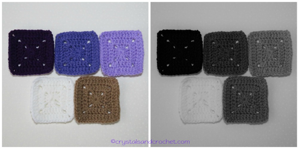
So here are the colours I have chosen.
Emperor, Violet, Wisteria, White, and Mocha.
The Rule of 5 applies, 3 purples, 1 neutral – White, and one contrasting colour, which for purple/violet is yellow, so my yellow is Mocha, which is actually a warm neutral, but you can see how easy it is to bend the rules. And the Mocha is close in colour to Oak, so that was my reason for the choice.
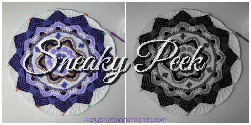
I will be using lots of white, with with the purples highlighted between, and little bits of the Mocha scattered throughout the design.
Here is a sneaky peek, so that you can see how the colours are working, and what I will be working on over the festive season.
I hope you have found this helpful, and that just maybe, it has taken a little more fear out of choosing colours, and understanding how to put them together.
♥ If you need help and advice, the quickest way to find support is to join Helen’s Hookaholics Facebook group. There you will find a very supportive group of likeminded people. It’s also a great place to share your crystalsandcrochet makes, and see what others are making, and see what I am up to.
♥ If you are not a fan of Facebook you can always email me with any questions you may have by using the contact form here.


