Sign Up
Already have an account? Sign in here
Sign In
Dont have an account? Sign up here
Choosing Colours for Your Crochet Projects
Choices, choices, choices…. And decisions, decisions, decisions.
Where on earth do you start when you want to pick the perfect colour pallet for your next crochet project?
I have already done two blog posts all about colour, A World of Colour, and Colour Me Happy.
So why another post all about colour?
Well, I’ll tell you……
As many of you know I spend a fair bit of time, connecting with other like-minded souls on Facebook, especially in some of the crochet groups. And over and over again I see people saying they can’t put colours together, or don’t know where to start.
The post A World of Colour is all about colour theory, using yarn I show you all about the colour wheel, cool and warm tones, and neutrals.
Then in Colour Me Happy, I move on to show you a little more about putting colours together.
This post is adding to both of those and is chock full of photos to give you ideas and inspiration.
Firstly, let me share a little secret.
I have always found that colours work best in odd numbers, somehow the balance always feels better to me.
5 is the magic number.
Five [5] seems to work best. Now this could be five different colours, or 5 shades of the same colour.
Remember there are NO RULES!! Often I go with 7 or 9 or 11, or only 3.
Whichever way you go, and how ever many colours you use, think about balance.
Let your choices be pleasing to the eye, and let yourself feel the balance within the colours.
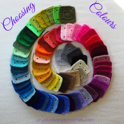
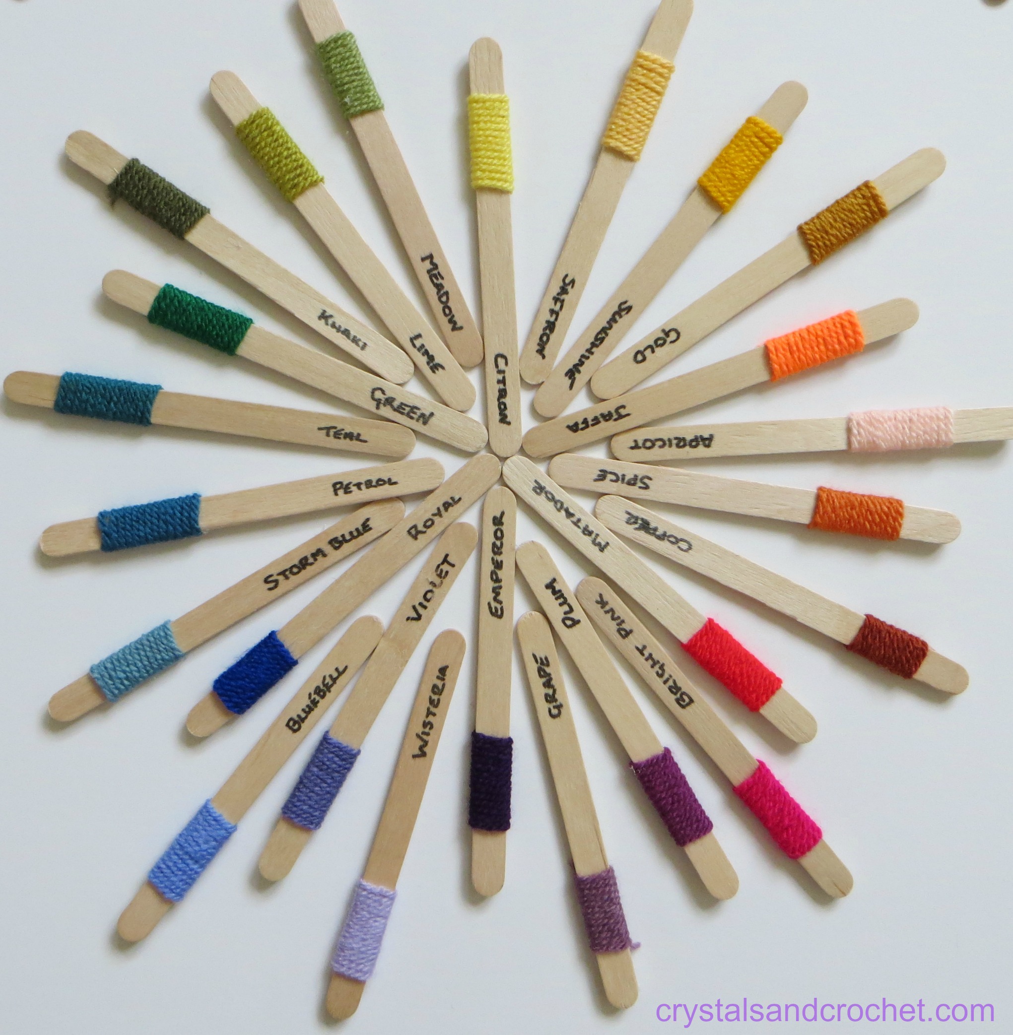
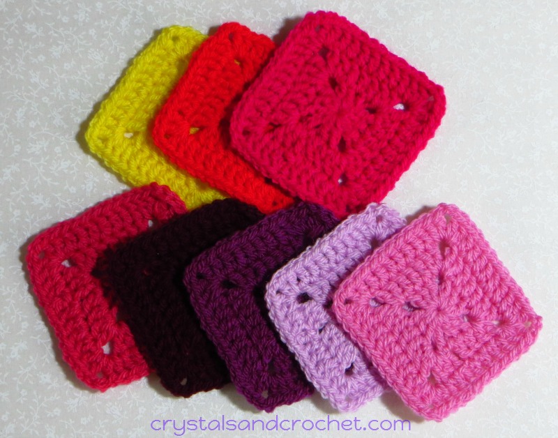
Ok so I have spent the past few days playing with my lolly sticks, and then I felt, nope, I just can’t get the right feel with these.
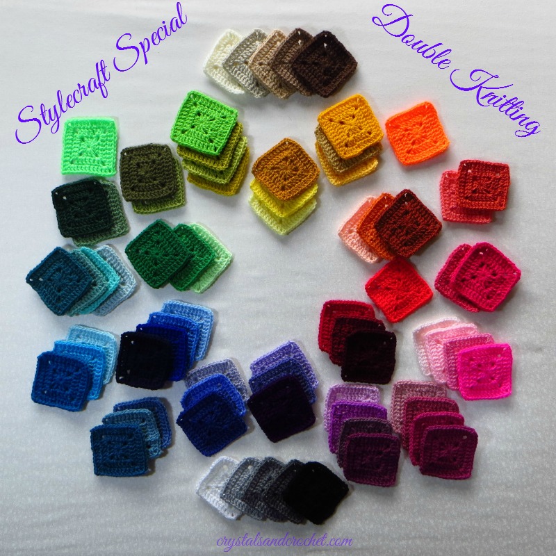
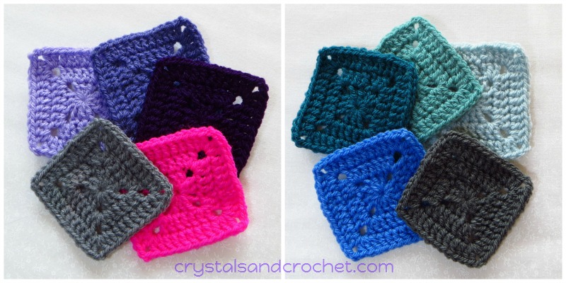
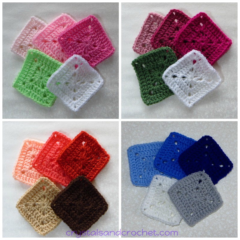
So I made a little, 3 rounds square, in each of the solid colours from the Stylecraft Special Double Knitting range.
This is my go to yarn, as I love the weight and feel of it, it is consistently good quality, has a good substance in feel, and washes and wears really well over time.
So here is the full range.
So lets look at 5 squares in each of the colour groups.
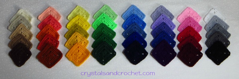 From light to dark, we have warm neutrals, orange, yellow, green, blue, violet, red, and cool neutrals.
Here is a reminder of the colour wheel.
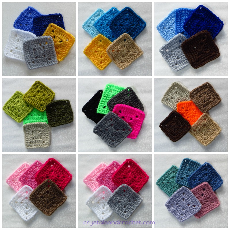
Now lets see how we can mix them up, for some stunning colour combinations, that maintain a balance, and a pleasing aesthetic look.
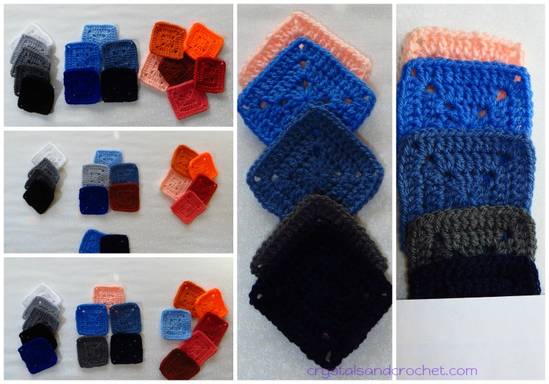
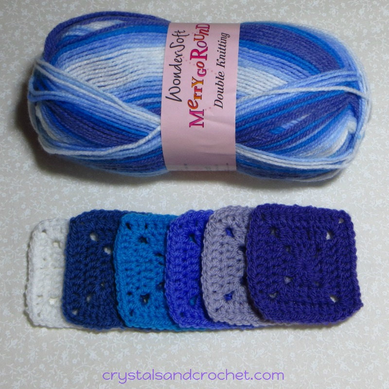
First we will take 5 blues.
Cloud Blue, Aster, Denim, Royal, and Midnight.
Take the cool neutrals, and the oranges, which are the opposite or complementary colour.
Then we take out 1 blue, and replace with a neutral, and 1 more blue, and replace with an orange.
Keep swapping colours in and out until you have the mix you like.
I have chosen to replace the lightest blue with the lightest orange, and the 4th blue with the 4th neutral.
Then, this is where the squares work so well, now we can move the squares around to see how much of each colour we want. Do you want mainly blue with just a hint of the neutral and complementary colours, or do you want an even amount of each?
The photos on the side show my final choice, and how much of each colour I want. By putting a piece of white paper over the Midnight square I am able to see the balance of my colours. So I will work with 1 part Apricot, 3 parts each of Aster and Denim, 2 parts of Graphite, and 1 part of Midnight.
Now it will be easy to look at what ever design I want to make and work out which colour I am going to use for which rounds.
Here are some other combinations you may like the look of, or not! remember it is all personal choice, all of these are based on 3 colours from 1 group with a neutral and a complementary.
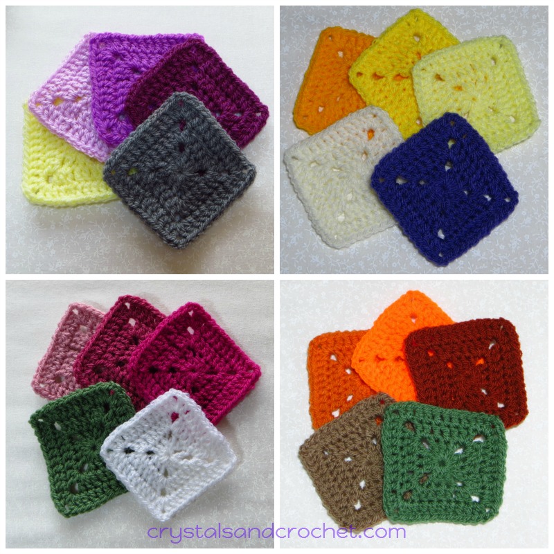 Clematis, Magenta, and Plum, with Lemon and Graphite.
Sunshine, Citron and Lemon, with Cream and Lobelia.
Pale Rose, Raspberry and Fuchsia Purple, with Cypress and White.
Spice, Jaffa and Copper, with Mocha and Cypress.
The other mix we can work with is a harmony mix. This means we will again use a main colour group, but this time we will add a colour that sits next to our main group on the colour wheel. And we will add in a neutral.
 Wisteria, Violet, and Emperor, with Fiesta, and Grey.
Fiesta is a pink, so sits in the red part of our colour circle, which is next to violet.
Duck Egg, Sage, and Teal, with Aster, and Graphite.
Aster sits in the blue part of our colour circle, next to green.
Or maybe you want to follow a seasonal theme, like a spring, Apple Blossom colours, or more towards summer with an English Rose theme. Fall or Autumnal colours are always great for cozy blankets. And frosty blues with silver and white give that winter feel.
 The possibilities are endless, and whatever brand of yarn you like to work with, or even if you want to mix different brands together, (remember to stick with the same weight of yarn), the choice of colours is never ending……
Be brave, be bold, use what ever you want as inspiration, but most of all have fun 🙂
If you don’t have a full range of colours, or a tool like the lolly sticks or little squares, then you can still do the same thing with photos. Make yourself a file on your tablet or pc and save all the photos of colour schemes you like. Then when it comes time to start choosing you already have loads of ideas that give you the “Ooooo Factor” or the “WOW factor”. Look at projects that others have completed, that you like the look and feel of, and think about how you could switch the colours around to suit your own taste or decor.
Use online tools like Design Seeds to help you. You can search on there by colour and it will give you loads of ideas. Then check out your favourite yarn and match the colours.
Here is a little example.
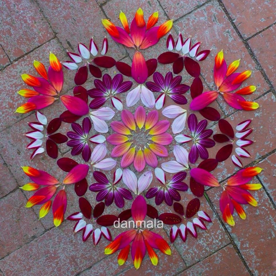 This is a stunning Mandala, with lots of pinks, and just a pop of yellow.
Here is what I matched up.
 But also look at the placement of the colours in the mandala picture, see the balance?
That would give you the idea for which colours to use in which rows or rounds.
Of course you can also go with the “lucky dip” approach, just put all your yarn in a bag and put your hand in and see what colour comes out. Don’t over think it, let it all flow naturally and you will be amazed at the gorgeousness you can create.
If you want to use multi coloured yarn, think about breaking it up with a solid colour.
If your project has a lot of texture in the stitches, sometimes you can loose that if your yarn is too busy. But if your stitch work is fairly simple and plain, then busy yarn can look amazing.
I made this little bag, because I wanted to try out the Stylecraft Merry-go-round yarn.
It is made with a very simple “up and down” stitch.
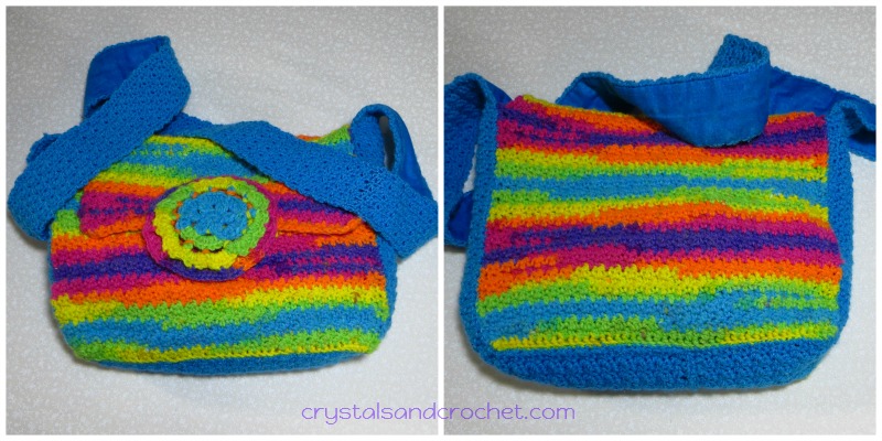 So I picked the Turquoise to use as a solid, and it gives a lovely bright, bold accent.
I also have another ball, in a different colour way.
Which solid would you choose to go with this yarn?
I hope this has given you some food for thought!
Maybe one of the colour combinations has really “spoken” to you.
Never be scared of colour, go for it, and if you feel it is not working… don’t sling it in a corner never to see the light of day again. Think about it, ask yourself why is it not working?, how do I need to swap the colours to make it work?
That is the fun of learning, and that is how we gain experience.
Get it wrong a thousand times.
Make changes and try new colours together.
That is where the fun is in life….doing the same old, same old will get boring.
Live life to the max and jump out into the amazing world of colour that is out there waiting for you.
Go on be brave. 🙂
♥ If you need help and advice, the quickest way to find support is to join Helen’s Hookaholics Facebook group. There you will find a very supportive group of likeminded people. It’s also a great place to share your crystalsandcrochet makes, and see what others are making, and see what I am up to.
♥ If you are not a fan of Facebook you can always email me with any questions you may have by using the contact form here.

Partners
My Recommended Suppliers