Sign Up
Already have an account? Sign in here
Sign In
Dont have an account? Sign up here
Colour me happy
Choosing colours for your next crochet project can sometimes seem so daunting.
There are hundreds of different brands of yarn and a gazillion different colours to choose from….
If you would like to understand more about colour theory then please take a look at this post…..
A World of Colour.
So where to start?
Some simple questions can help…
Who is it for?
Where is the item going to be used?
What is the surrounding colour scheme?
What effect do you want the item to have?
How do you want to feel when you look at the item?
Yes, the last two questions there are crucial to the success of your project, colour has a massive impact on our mood and behaviour.
Soft, gentle colours will help us to relax and unwind, where as strong, bold, bright colours will energize us.
Children’s toys in bright, lively colours will help to inspire their creativity in play. But for rest or nap time a gentle relaxing hue will be far more productive!
There are some wonderful colour generator sites out there on the internet, use them to help you.
One of my favourites is Design Seeds. Once you have had a good look through you will start to “get your eye in” and be able to take a photo and make up your own colour pallets.
So lets look at some colour combinations…..
There are two basic groups of neutrals.
Warm neutrals which have a yellow undertone and will harmonize with any colours on the warm [yellow/red] side of the colour wheel.
Cool neutrals which will harmonize with any colours on the cool [blue] side of the colour wheel.
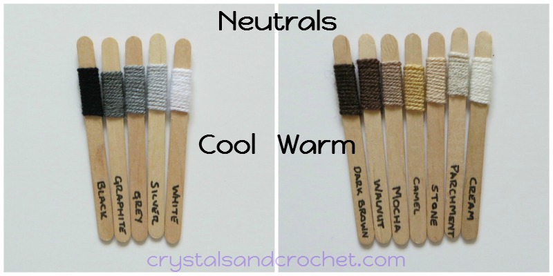
Mix up neutrals with bright colours to really make them “pop”.
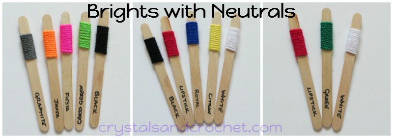
Remember that a harmonizing colour is one which shares the same tone and a contrasting colour has an opposite tone.
so here is an idea….
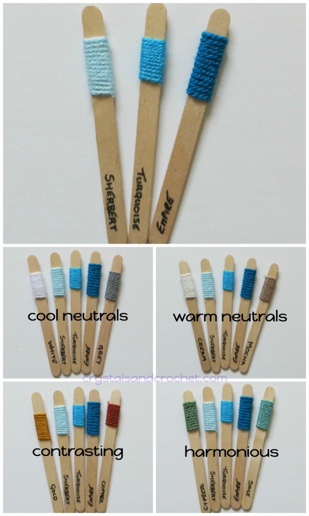
Take three blues…. here Sherbert, Turquoise and Empire. A balanced mix of light, medium and dark, these colours all have a slight green undertone.
They sit on the cool side of the colour wheel, white and grey make a harmonious blend with neutrals, but cream and mocha, which are warm neutrals, also blend beautifully and give a softer hue to the colour pallet.
To keep the pallet soft and gentle, with a relaxed and tranquil feel, add harmonious colours like cypress and sage, which are both muted [grey toned] greens.
Or go for some zing and add contrasting gold and copper from the opposite [orange] side of the colour wheel.
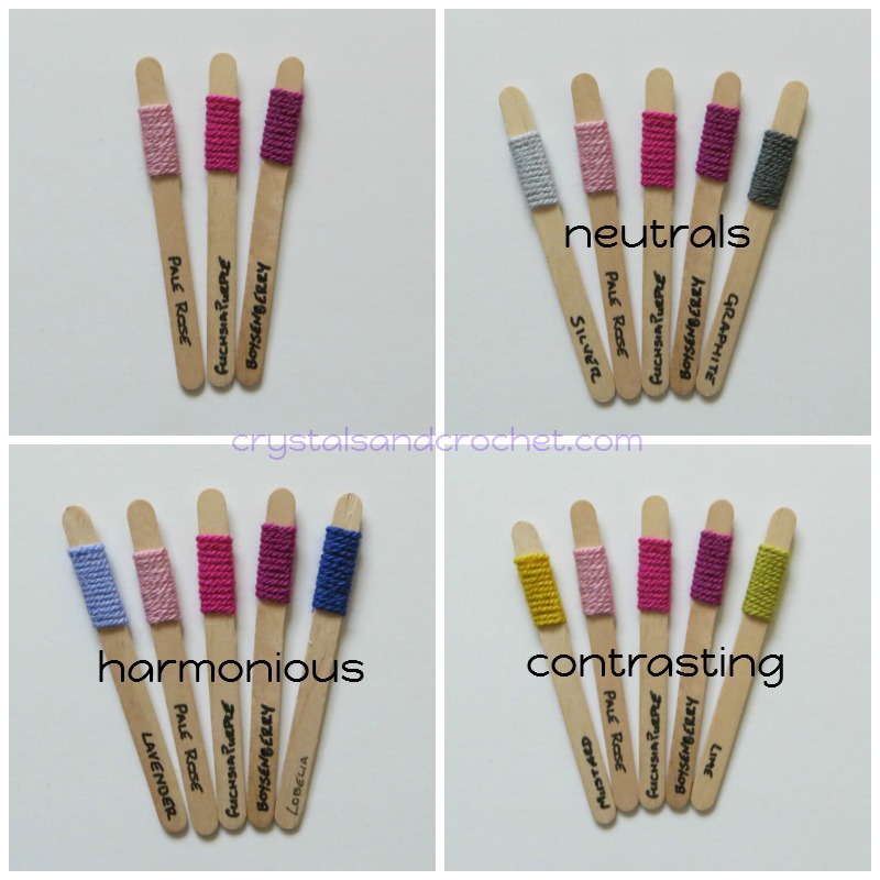
Here is another example with pinks….
These pinks have a violet undertone and so sit between red and violet on the colour wheel.
They work prefectly with grey neutrals, graphite and silver.
Lavender and Lobelia are in harmony and blend beautifully, or go a little crazy and add lime and mustard from the yellow/green area of the colour wheel.
Colour is so much fun, a cup full of knowledge, a pinch of patience, and a spoon full of experimentation and you will soon be creating the most amazing projects that will light up your life and the lives of those you love.
Here are just a few more ideas……
Gorgeous Greens….
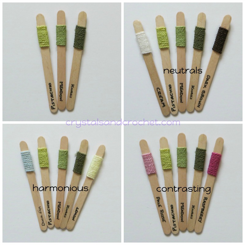
Imagine stormy summer skies with a bright splash of colour.
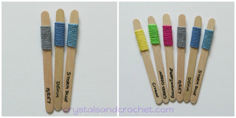
PLAY with colour, let it be fun, involve your kids and friends, be bold, be brave, but above all…. BE CREATIVE 🙂

♥ All of my tutorials are free and are written or recorded using US terminology.
♥ If you need help and advice, the quickest way to find support is to join Helen’s Hookaholics Facebook group. There you will find a very supportive group of likeminded people. It’s also a great place to share your crystalsandcrochet makes, and see what others are making, and see what I am up to.
♥ If you are not a fan of Facebook you can always email me with any questions you may have by using the contact form here.


