Sign Up
Already have an account? Sign in here
Sign In
Dont have an account? Sign up here
A World of Colour

The world is full of colour. It is literally all around us.
Can you imagine a world where everything was the same colour?
Nothing would have any depth, there would be no “WOW” moments when you see that amazing sunset, or look deeply into a flower and notice the amazing colours.
Imagine never seeing a rainbow!!! “shudders”
Rainbows always make me feel like a kid at Christmas!!
I just couldn’t live in a world without colour.
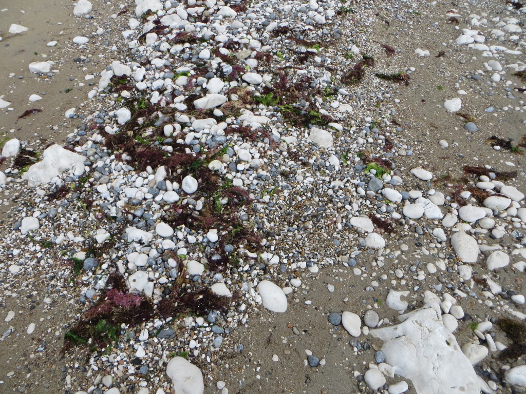
Sand and pebbles can seem quite dull, but Mother Nature adds the most amazing splashes of colour with this seaweed.
But then colour has been a major part of my life for many years.
As a hairdresser and teacher colour was a massive part of everyday life, and I was often surprised when a new student would not even know what the primary colours were!
I often used to shake my head and say “what do they teach in schools these days”.
But as soon as I started to teach they would remember back to infant school and those paint pots and brushes….which I used to use as a tool for teaching about colour.
Now it doesn’t matter if you are colouring hair, painting or crafting you will need a basic understanding of colour to achieve the results you want.
Just as a little extra info… I am also a Colour Therapist and use colour in my healing work, and fully understand the impact colour has on our physical and mental health.
So this is not a short article, but I hope it will inspire you to try new things and to have a greater understanding of how colours work and the amazing impact using certain colours together can have.
As I am intending this to help all you Happy Hookers out there to gain more confidence with colour choices all the colour “sticks” I have used are from the Stylecraft Special range. So they are “real” colours to us not just the theory, and these ideas and knowledge can be used with any of the hundreds of different brands of yarn out there.
So let’s start at the beginning, the photo below shows the three primary colours, red, yellow, and blue.
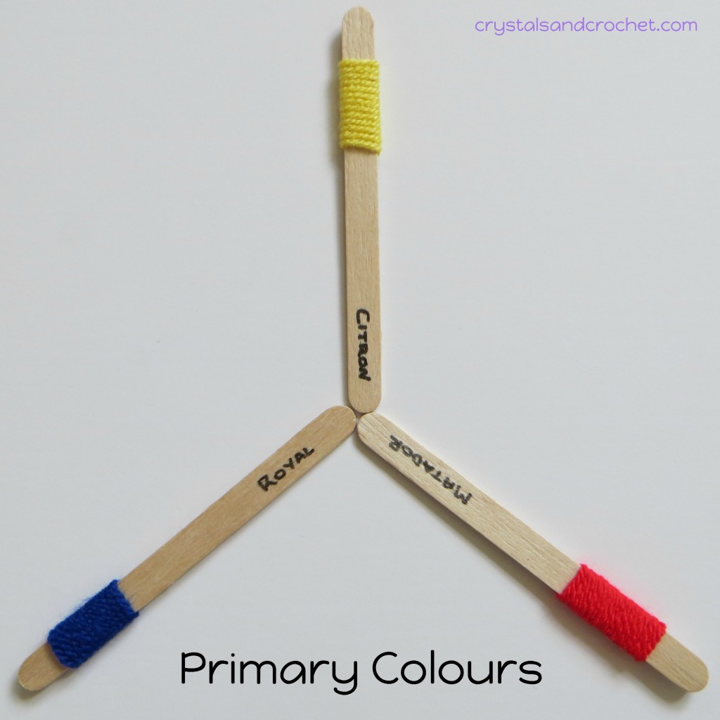
Every colour you can possibly imagine is made up of a combination of two or more of these three colours.
If however you mix all these colours together in equal amounts you get a sort of sludgy brown.
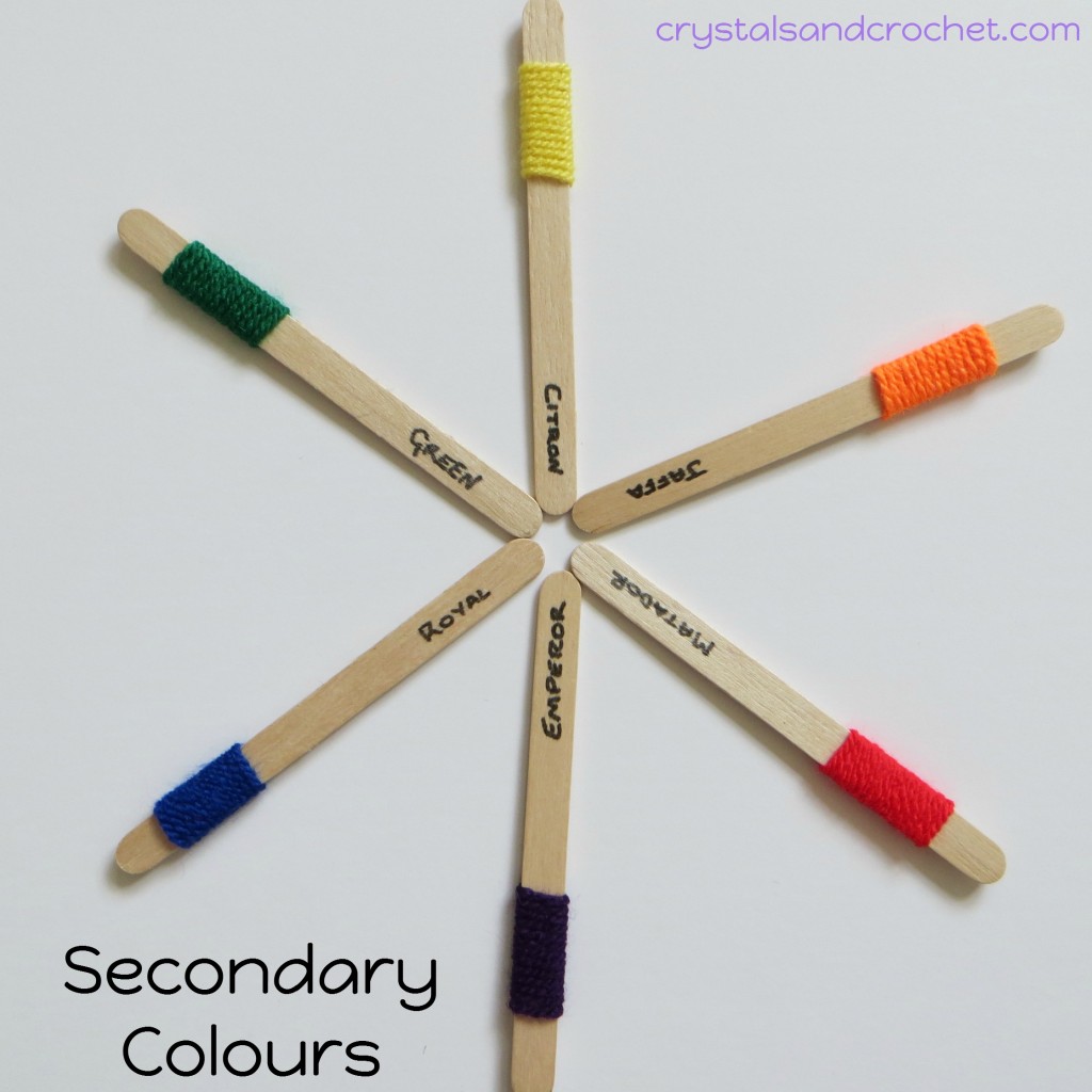
Secondary colours, as shown in the photo below, are made of combining two of the primary colours together. As you can see when we mix yellow and blue we get green.
Yellow and red give us orange, and blue and red give us violet or purple.
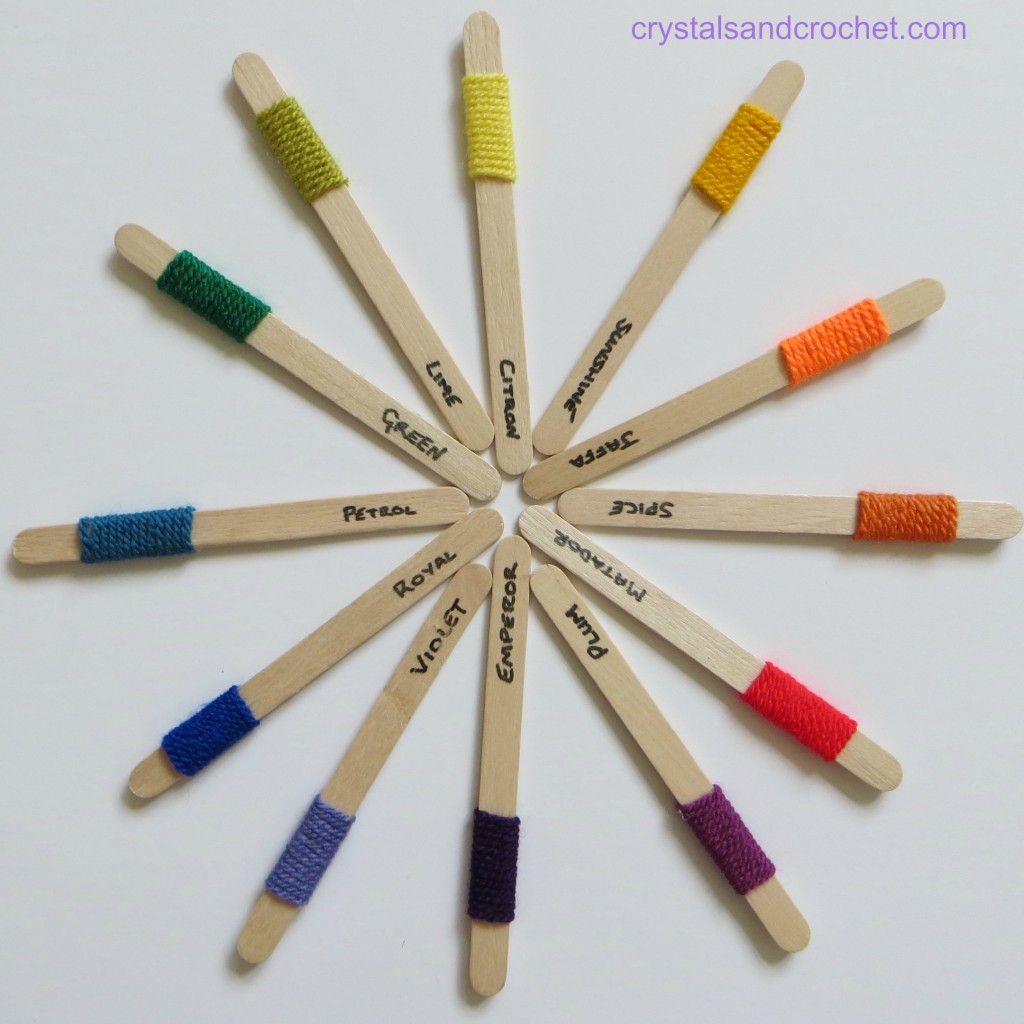
When we move further on with this principle and add a little bit more of a primary colour to a secondary colour we get yet another variation of colour.
As you see in the photo below of the colour sticks between primary and secondary colours.
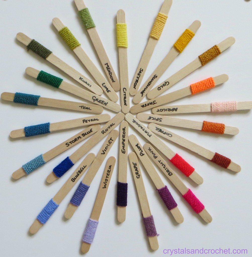
And moving futher on…
Next we need to look at the value of colours.
There are two principles here. One is the depth of colour which is the amount of colour present. The second is the tone of colour which is the combination of colour.
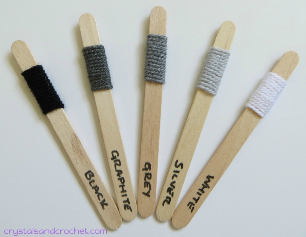
As you see the photo below which shows black through three shades of grey to white.
A little something to add here is don’t be fooled into thinking that black is black, and white is white, because there are actually over 200 shades of white!
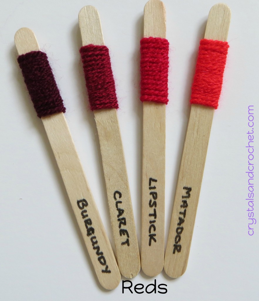
As you look at the reds below, can you see which has more blue, and which has more yellow?
Where do I start?
When you are choosing a colour scheme there are so many options it can be truly mind boggling and quite daunting. Start with something simple, like is this item to match your decor or is it for a baby, a man, your sister etc…. who or what ever it is for will be a starting place, then you can build from there.
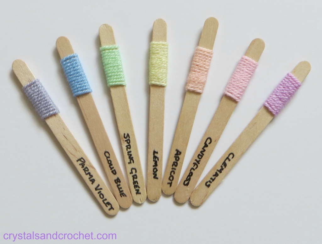
For babies we all tend to go for the softer, pastel shades.
Any project can be gender neutral if we use a mixture of colours, or just omit the two obvious blue for a boy and pink for a girl colours.
Because I just love to bend or break the rules, this is a baby blanket I made for a beautiful little chap.
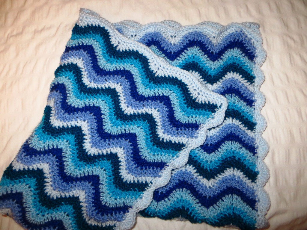
Six shades of blue baby blanket
Blues can be warm or cool, going back to our colour wheel, it all depends on the combination of colour.
Does it have more yellow, making it a green/blue or does it have more red, making it a violet/blue?
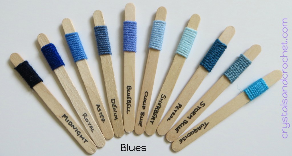
As you can see Midnight is a very dark blue, Royal is very bright, Aster is a clear mid toned colour and Cloud Blue is a pastel.
Denim has a grey tone as does Storm Blue. Sherbert and Petrol have a green undertone.
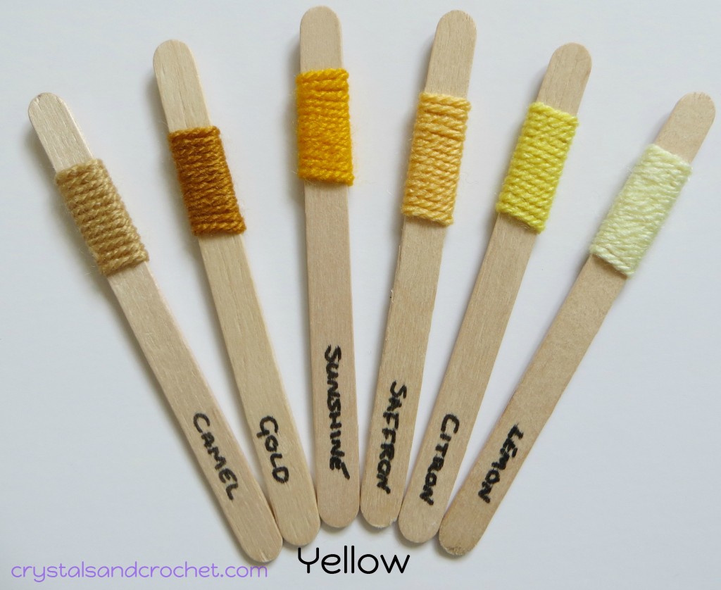
Yellows can also have different tones.
The more red there is in the mix, the more orange the yellow will be.
Also look at all these lovely purples and violets…
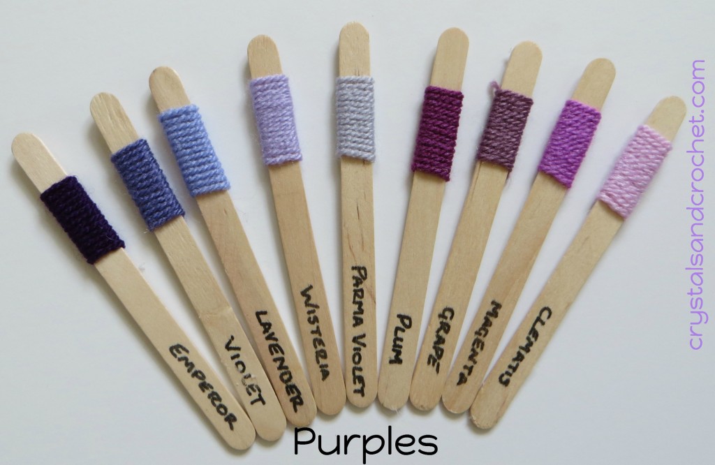
Can you see the difference between the blue/violets and the red/violets?
We already looked at reds. But how about pinks?
Again here you can see the different tones and combinations with in this range of pinks.
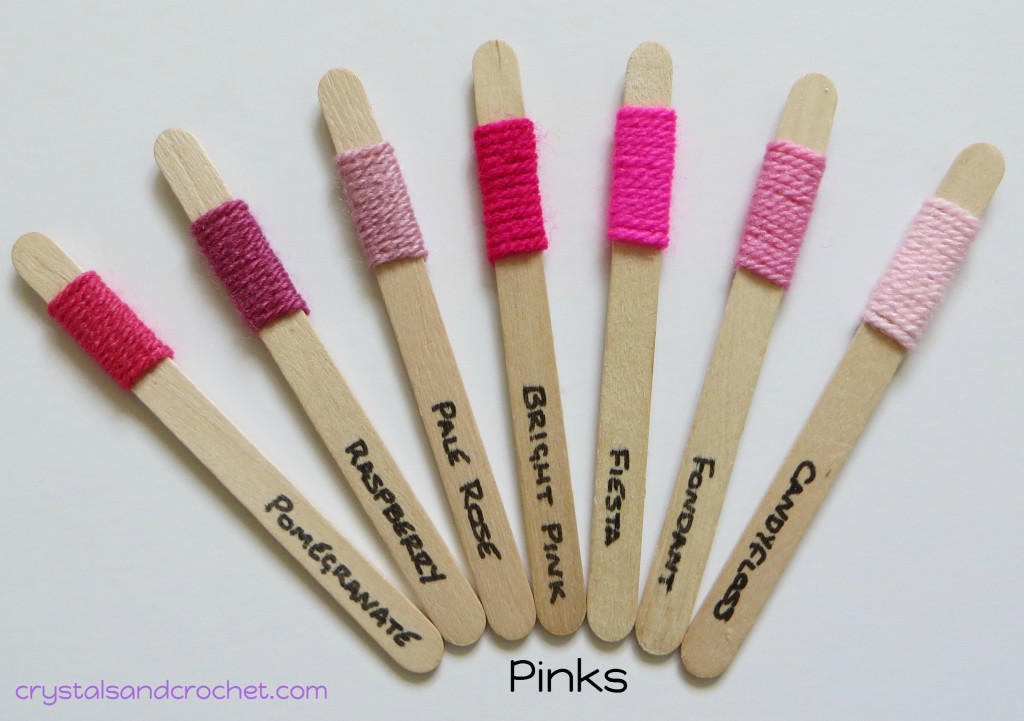
Pomegranate has a slight orange tone to it, and Raspberry has a violet tone.
Remember how light or dark a colour is depends on the amount of colour and the tone is the combination of colour.
There are some amazing sites you can use to help you to identify colours, like design-seeds.com
Take photos of things that inspire you, or look through magazines, where ever you can get inspiration from is perfect. Because there is no wrong way to find colours you want to work with.

Whether you want rich earthy tones or soft summer tones, or bright colours, you can use what ever you like. If you want one dominant colour then use other colours that will make your main colour “pop”.
To make a colour pop, use colours that contrast rather than blend with it.
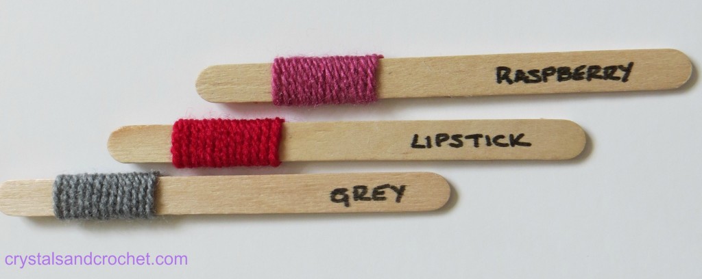
Here the Lipstick and Raspberry complement each other but the Grey makes them “pop” out at you.
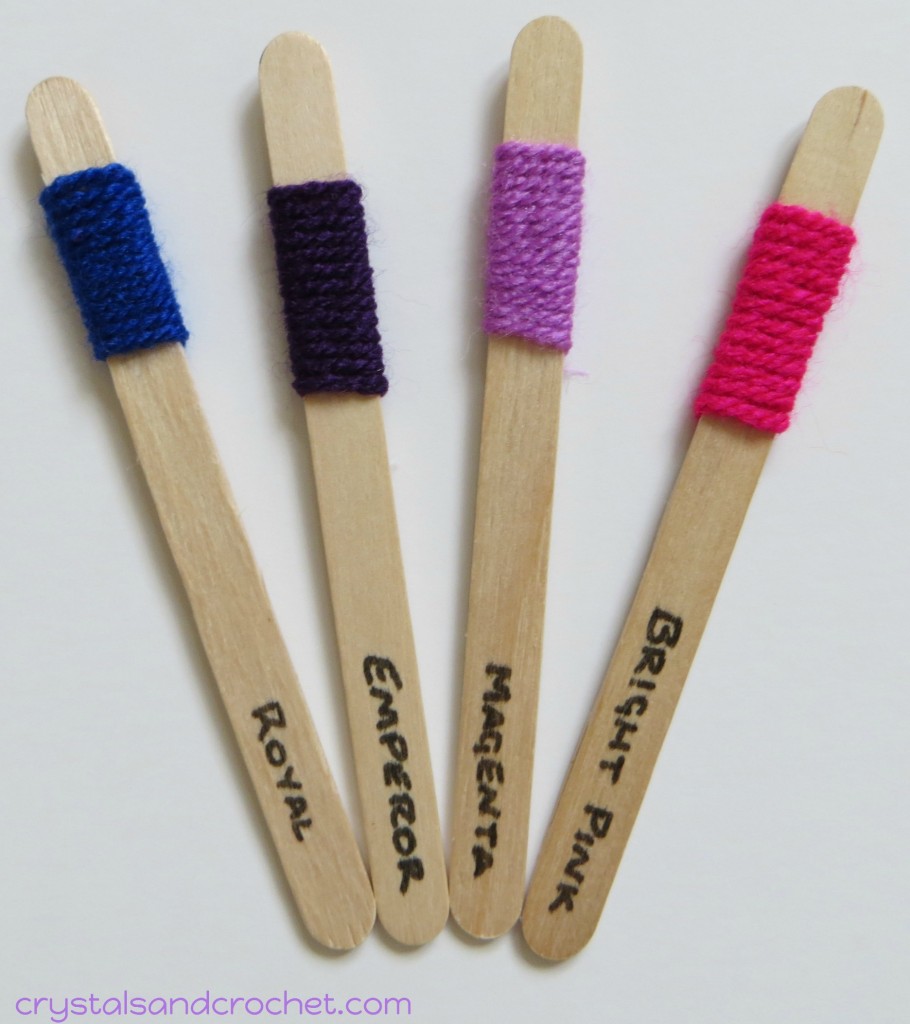
These are all bright colours, and being all cool or blue based they blend well together.
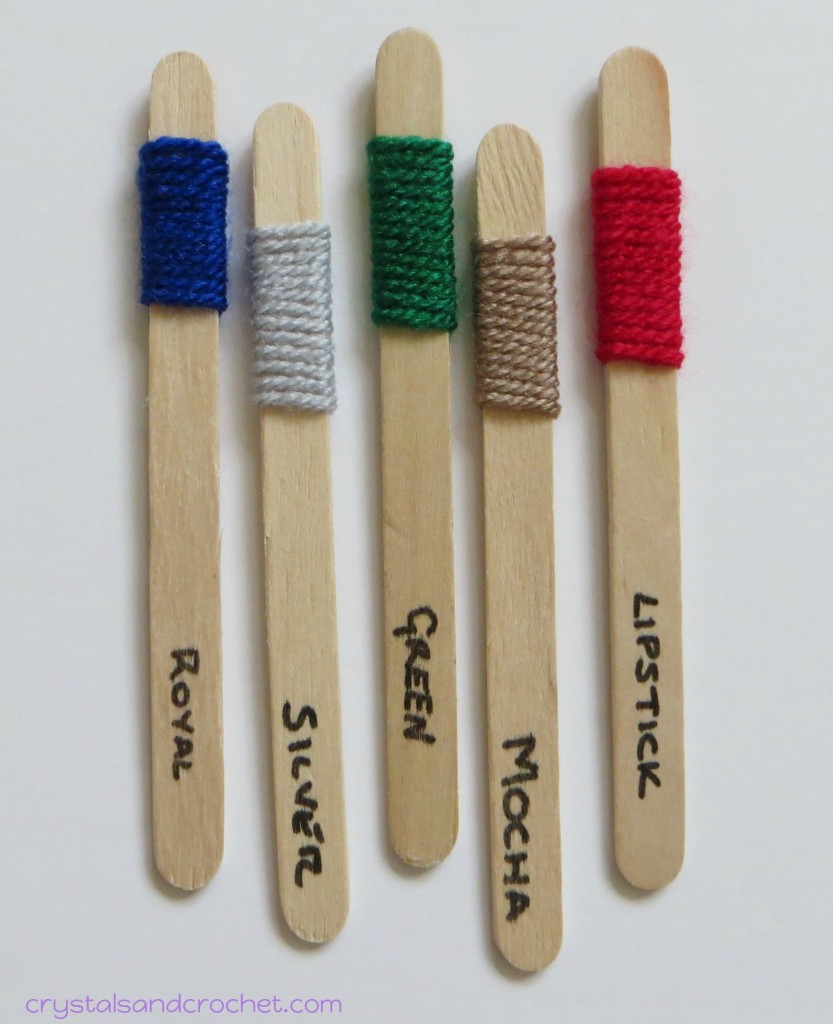
Now I know many people have a problem with “red and green should never be seen, without a colour in between” but Mother Nature does it perfectly with Holly Trees!!
And there are some people who say it’s blue and green that should never be seen.
Well green already has blue in it, so that is not the problem, the problem is when bright colours are put together they tend to scream at us, so use them, but break them up a bit with something more neutral.
Working with colour should always be fun 😀
Never limit yourself or the joy you can find in playing around with colour.
Whether you use shades/tones of the same colour, or a combination of bright and muted colours, this should be fun, not stressful.
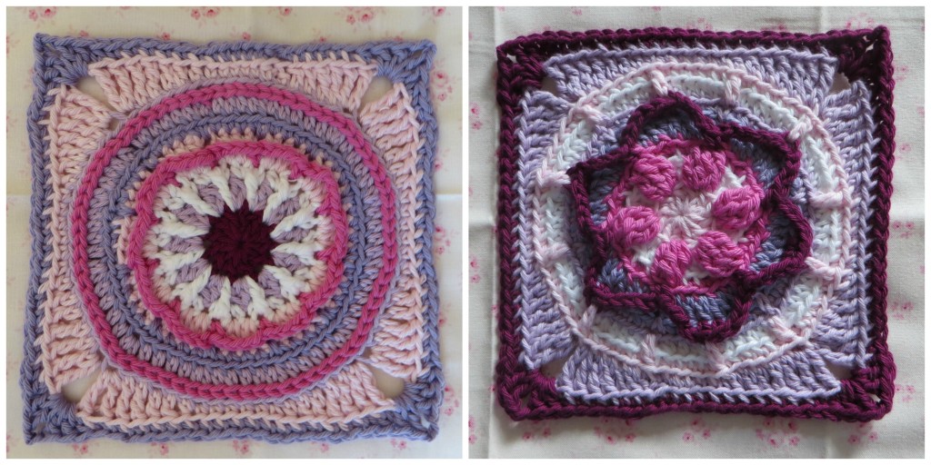
If you are unsure, try making a few small squares with different combinations of the same colours to see how the placement of the colours can change the look of your work completely.
In the Official CCC group on facebook we are currently doing a CAL [crochet a long] circles-of-sun with Tatsiana of lillabjorncrochet.blogspot.co.uk
Here are my blocks 1 and 2, same colours, but they look totally different because of the colour placement.
So be bold, be brave and let colour light up your life.
♥ If you need help and advice, the quickest way to find support is to join Helen’s Hookaholics Facebook group. There you will find a very supportive group of likeminded people. It’s also a great place to share your crystalsandcrochet makes, and see what others are making, and see what I am up to.
♥ If you are not a fan of Facebook you can always email me with any questions you may have by using the contact form here.
